Serengeti, Tanzania, Africa.
For todays post I want to do both my regular photo story but I also want a critique. The main question I want to know is do you like the colour or black and white version better? And why?
This was taken in the last few hours of this years photo safari. We were all ecstatic that just a few hundred meters from the airport we were still being greeted by scenic views and tonnes of wildlife, talk about a great send off for our final day!
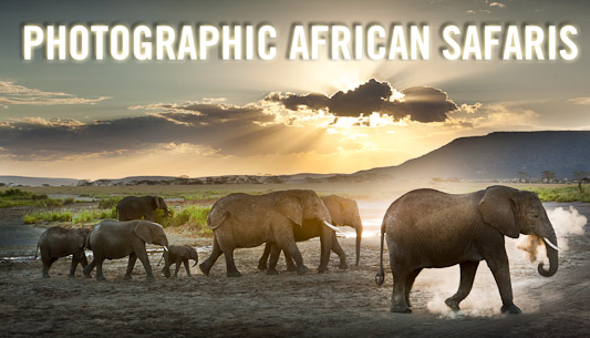
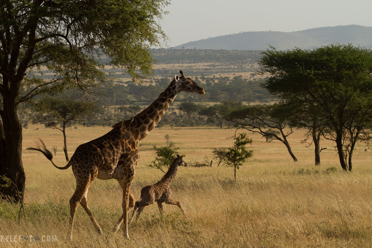
Photographic Details: This troupe was making their way across the Serengeti and the backlighting isn’t ideal for photography. I began to think “well okay backlighting is tough for detail, so let’s focus on getting a silhouette”.
I like how easy it is to tell by their body language that this herd wasn’t just grazing, they were heading somewhere and on a mission. By working with the silhouette in mind I’ve taken advantage of the pros of this type of lighting instead of fighting against the cons.
Canon EOS 7D, 100-400m L lens at 190mm, 1/320 shutter speed f7.1
So let me know, BW or colour?
Click on the thumbnail to open the gallery [gall columns="1" postcount="2" ]
More details on my photo safaris here:
http://www.kylefoto.com/photographic-african-safaris/
Update:
I have to share some fantastic comments here that critique these photos better than I ever could!
Out of 31 we have 20 for colour and 9 for bw.
Your comments go beyond just this simple question though, all this talk about the context of the images, how or where someone is displaying these photos change the photos, and how the intention of the photo changes which image is more powerful.
+Kerry L +Brad Ganley and +Louisa Catharine Forsyth mention how the power and impact of the animals is much more pronounced in the BW version, that there is more emotion associated with it. +Jorge henrique Cordeiro hits the nail on the head with the black and white version being art but the colour version being more truthful to what africa actually looks like.
+Shawn Clover highlights that the blue and orange in the colour photographs are complimentary, likely a reason for the favour in the colour image.
More importantly this stellar interaction speaks to the intelligence and engagement of this community, you guys are incredible!


